Mastering the Art of Color Coordination in Home Decor
The Power of Color in Home Decor
Color is an indispensable element in the realm of home decor. It holds the incredible power to transform a space, evoking emotions, setting moods, and shaping our perceptions of a room. The importance of color coordination in home decor cannot be overstated, as it plays a pivotal role in achieving the desired atmosphere and aesthetic in any living space.
Understanding Color Theory
Primary, Secondary, and Tertiary Colors
At the core of mastering color coordination lies a profound understanding of color theory. We begin with the basics: primary, secondary, and tertiary colors. Primary colors—red, blue, and yellow—are the building blocks of all other colors. Secondary colors are created by mixing two primary colors, such as green, orange, and purple. Tertiary colors, on the other hand, emerge from mixing a primary color with a secondary color, resulting in a vast spectrum of shades and tones.
The Color Wheel and Its Significance
The color wheel serves as our compass in the world of colors. It organizes colors in a circular format, helping us visualize their relationships and harmonies. By studying the color wheel, decorators gain insights into which colors complement or contrast with each other, facilitating informed decisions in color coordination.
Color Harmonies and Their Impact
Color harmonies, often derived from the color wheel, are key to achieving visually pleasing arrangements. Concepts like complementary colors, analogous colors, and triadic color schemes provide decorators with tried-and-true formulas for creating balanced and harmonious spaces. Understanding these harmonies is essential for successful color coordination.
Choosing a Dominant Color
Setting the Tone with Dominant Colors
In any interior design project, selecting a dominant color is a pivotal decision. The dominant color sets the overall tone and mood of the space, serving as the foundation upon which all other colors will be built. It’s the color that makes the boldest statement and captures immediate attention.
How to Select the Perfect Dominant Color
Choosing the right dominant color requires careful consideration of the room’s purpose, natural lighting, and personal preferences. Warm colors like reds and yellows can create an inviting and cozy atmosphere, while cool colors like blues and greens promote relaxation. By analyzing these factors, you can confidently pick the perfect dominant color for your home.
Accentuating with Complementary Colors
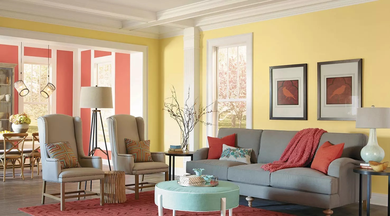
The Role of Complementary Colors
Complementary colors are pairs of colors that sit opposite each other on the color wheel, such as red and green or blue and orange. When used strategically, they create a vibrant contrast that adds depth and visual interest to a room.
Strategies for Effective Complementary Color Use
To prevent overwhelming the eye, it’s essential to balance complementary colors. Using one color as the dominant and the other as an accent can achieve a harmonious look. For example, in a predominantly blue room, orange accents can provide a striking contrast without becoming visually overpowering.
Creating Balance with Analogous Colors
The Subtle Harmony of Analogous Colors
Analogous colors are neighbors on the color wheel, sharing similar undertones. This color scheme offers a subtle yet visually pleasing harmony that’s ideal for creating cohesive interiors.
Balancing Warm and Cool Analogous Color Schemes
Whether you opt for warm or cool analogous colors, achieving balance is key. Too much of one can create a chaotic or monotonous feel. By incorporating varying shades and intensities, you can create depth and balance within your chosen analogous color scheme.
Incorporating Neutral Colors
The Versatility of Neutrals in Home Decor
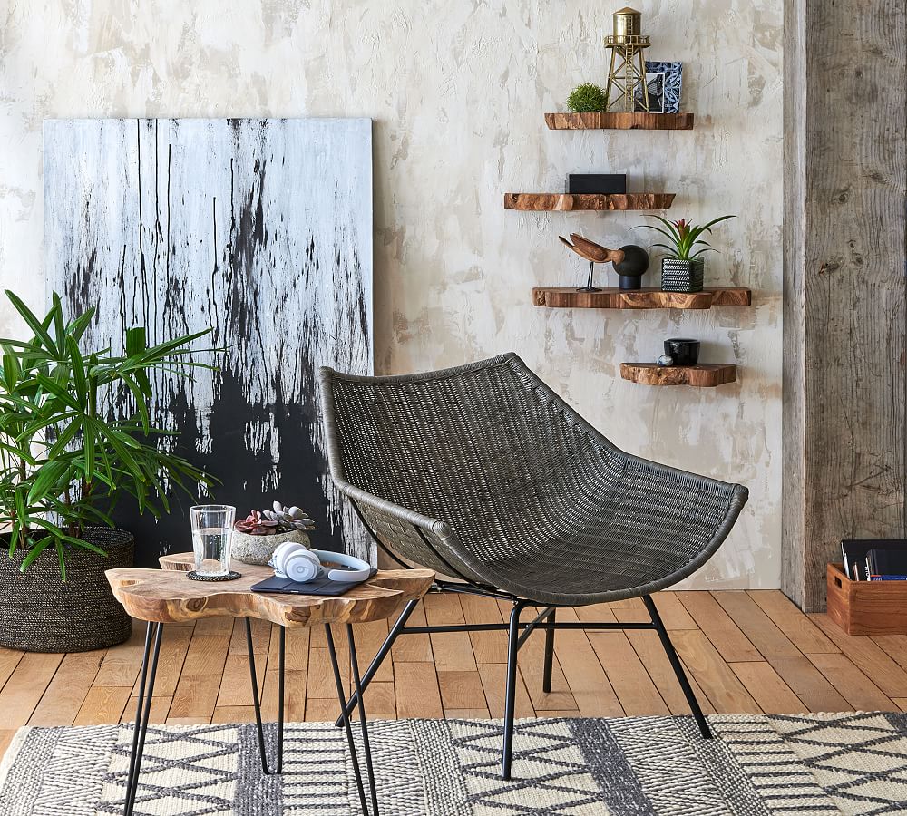
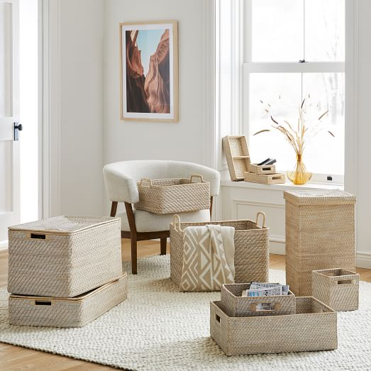
Neutral colors, such as white, gray, and beige, may seem unassuming, but they play a crucial role in home decor. They provide a calming backdrop, balance vibrant hues, and allow other elements in the room to shine.
Using Neutrals as a Foundation for Color Harmony
Neutrals can serve as a canvas upon which you can experiment with bolder colors through furniture, decor, and textiles. They also provide a timeless and elegant base that can adapt to changing trends and personal styles.
The Psychology of Colors in Different Rooms
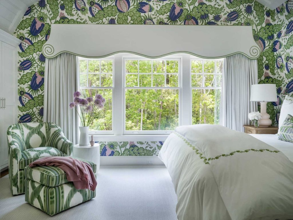
Bedroom Bliss: Calming and Invigorating Colors
In the bedroom, the choice of colors can significantly impact your quality of sleep and relaxation. Calming colors like soft blues and muted greens promote rest, while invigorating colors like warm oranges and rich purples can add a touch of romance and energy.
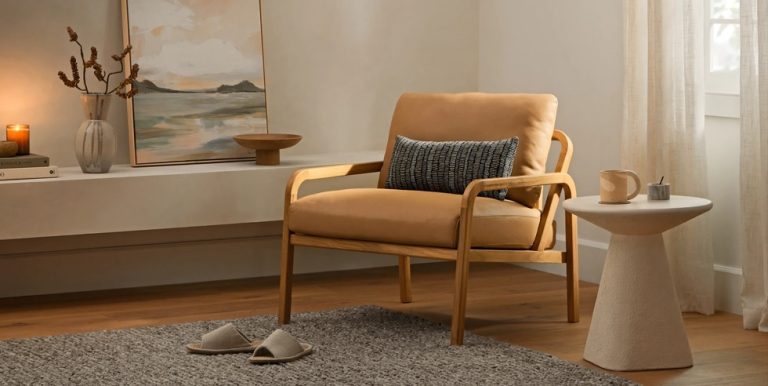
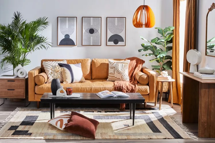
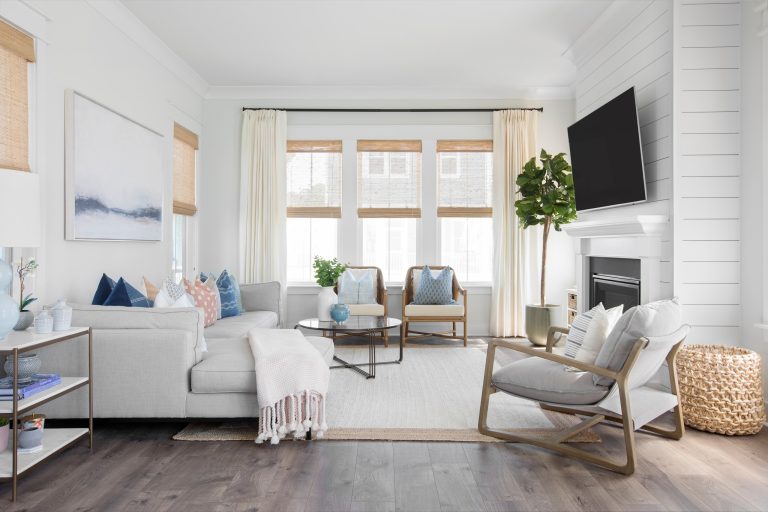
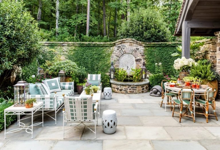
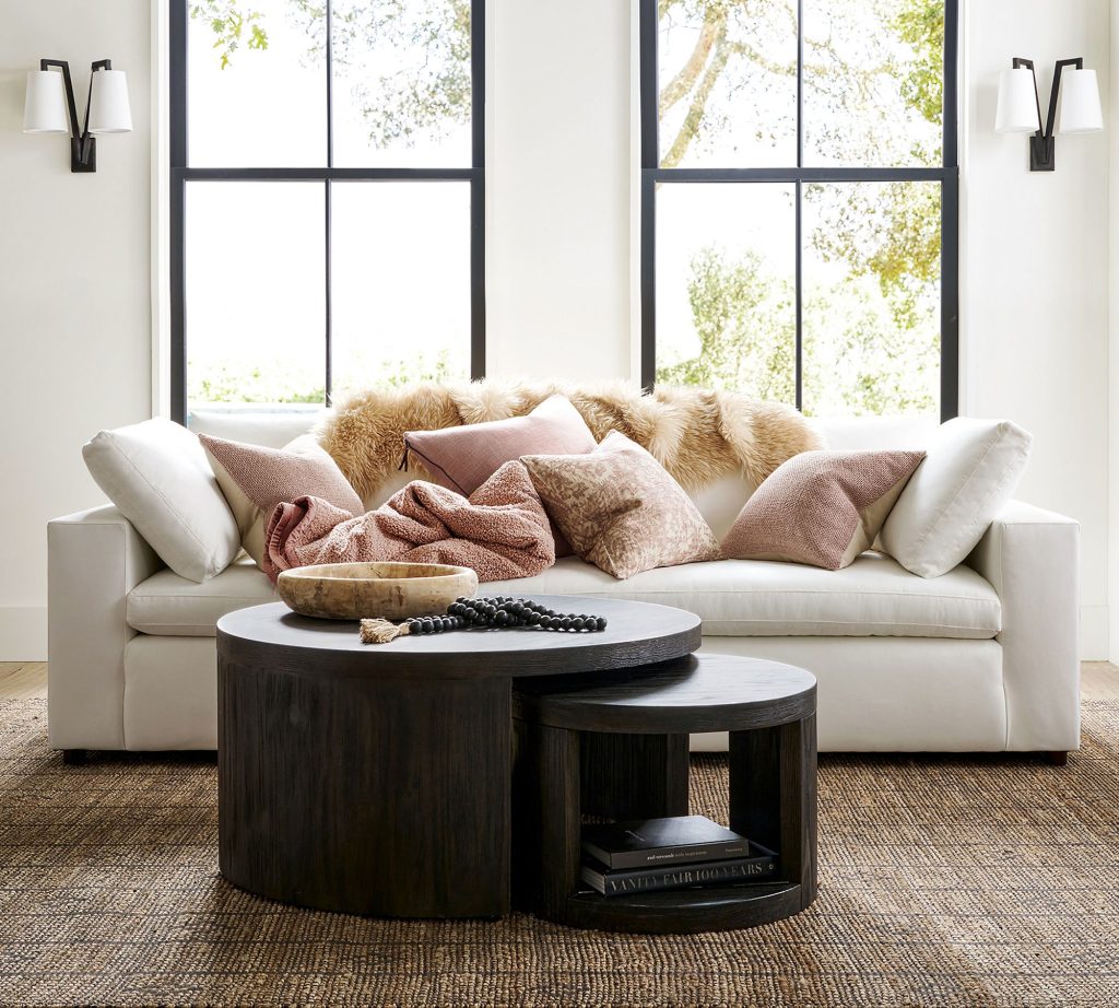
Living Room Elegance: Sociable and Relaxing Hues
The living room serves as a gathering space for family and friends. Selecting sociable and relaxing hues, such as warm earthy tones or cool, soothing blues, can create an inviting and comfortable atmosphere.
Kitchen Creativity: Energizing and Appetizing Tints
In the kitchen, the right colors can stimulate creativity and appetite. Energizing colors like vibrant reds and sunny yellows can inspire culinary adventures, while softer tones can create a serene dining environment.
Bathroom Serenity: Cleanliness and Tranquility through Colors
For bathrooms, cleanliness and tranquility are paramount. Light, cool colors like whites, soft blues, and pastel greens can convey a sense of cleanliness and serenity, transforming your bathroom into a spa-like oasis.
Color Coordination in Textiles and Accessories
Coordinating Fabrics, Curtains, and Upholstery
To maintain color harmony, it’s crucial to extend your color coordination efforts to textiles and accessories. Coordinating fabrics, curtains, and upholstery with your chosen color scheme ensures a cohesive and polished look.
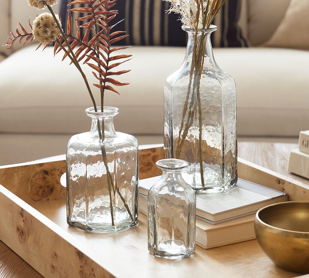
Choosing Decorative Accessories Wisely
Decorative accessories, such as cushions, rugs, and artwork, offer opportunities to inject personality and accentuate your chosen color palette. Thoughtful selection of these items can elevate your decor to new heights.
Practical Tips for Successful Color Coordination
Testing Colors in Different Lighting
Colors can appear drastically different under various lighting conditions. It’s advisable to test your chosen colors in both natural and artificial lighting to ensure they maintain their desired effect.
Maintaining Cohesion Throughout the Home
While each room can have its color scheme, it’s essential to maintain a sense of cohesion throughout your home. Repeating certain colors or elements in different spaces ties the entire home together.
Personalizing with Color Preferences
Lastly, remember that personal preferences should guide your color choices. Your home should reflect your unique style and personality, so don’t be afraid to incorporate your favorite colors into your decor.
In conclusion, mastering the art of color coordination in home decor is a multifaceted endeavor that blends artistic intuition with the principles of color theory. By understanding the fundamentals of color and applying them strategically, you can transform your living spaces into harmonious, visually stunning environments that cater to your every mood and desire.